A leasing agent I sat with last year had a habit I have seen a hundred times. He would drop a pin on a vacant shopfront, draw a 5 km circle around it, read off the resident count inside, and call that the customer catchment area. Seventy-one thousand people. Capture one per cent and you are away. The operator across the table nodded along, because the number was big and the circle looked authoritative, and neither of them stopped to ask the only question that matters: would any of those seventy-one thousand people actually come.
Most of them would not, and the ones who would were not all the same customer. The person who walks 400 m for a morning coffee and the person who drives 6 km on a Saturday for a specialty purchase both sit inside that circle, counted once each, weighted equally. They are not equal. They visit at different frequencies, they decide differently, they tolerate different amounts of friction, and they will not respond to the same rent, the same opening hours, or the same marketing. The single biggest error operators make with a customer catchment area is treating it as one ring of equally likely buyers when it is really a steep gradient of falling probability, sliced into segments that behave nothing alike.
There are two failures stacked on top of each other here. The first is overestimating the radius: drawing 5 km when the real pull for a cafe dies inside 1 km. The second is under-segmenting whatever radius you draw: treating the 400 m walker and the 6 km driver as interchangeable demand. The radius error inflates your forecast. The segmentation error means you build the wrong business for the customers you actually get. Both are expensive, and they compound.
Willing travel distance is not a constant. It varies by business type, because a destination furniture barn and a convenience cafe ask completely different things of a trip. And it varies by Australian urban density, because the same brand draws from a tighter ring in inner Sydney, where people walk readily, than in suburban Brisbane, where a 5 km drive to a centre is unremarkable and barely registers as effort. Get those two dials right and the catchment falls out of the analysis honestly. Get them wrong and you are forecasting from a circle that flatters you.

Figure 1. A customer catchment area is a gradient, not a radius. As trip distance grows, the share of trips walked collapses and the share driven climbs. Roughly two-thirds of sub-1 km trips are walked, yet 21% of even those short trips are still driven, and 60% of short trips to car-oriented centres are driven. Source: Victoria Walks, analysis of the Victorian Government VISTA dataset, 2019. Bands are schematic; markers are sourced values. Original Locatalyze diagram.
Why the customer catchment area is a probability gradient, not a circle
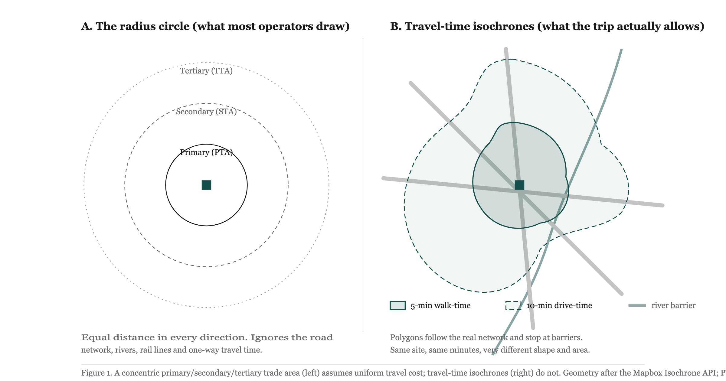
Start with the idea the circle quietly denies. A catchment is the area a site actually draws customers from, and the likelihood that any given household visits does not stay flat across that area and then drop to zero at a clean boundary. It decays. Huff put this on a formal footing sixty years ago: the probability that a consumer patronises a given centre falls as the travel cost to reach it rises and as the pull of competing centres grows (Huff, 1964). That is the distance-decay gravity model, and its single most useful implication for an operator is that a catchment has no edge. It has a gradient. The household 300 m away is far more likely to walk in than the one 3 km away, and the circle, by drawing a hard line at 5 km and counting everyone inside it as a head, erases exactly the variable that decides revenue.
This is why the radius count is worse than imprecise; it is directionally misleading. It assigns full weight to the marginal household at the boundary and to the next-door neighbour alike. Real demand is front-loaded toward the centre and thins fast toward the edge. A defensible catchment estimate weights each household by its probability of visiting, which means a small, close population can outweigh a large, distant one. The honest version of "seventy-one thousand people" is "seventy-one thousand people, of whom the nearest few thousand supply most of the trade and the rest contribute a long, thin tail." Planning practice has long encoded this expectation: a primary plus secondary trade area is typically expected to generate more than 80% of a centre's sales (Leyshon Consulting, 2017), which is another way of saying the outer ring you were so impressed by contributes the leftovers.
The mechanism behind the decay is travel cost, and travel cost is not straight-line distance. It is time, effort, and the friction of the route. A site three minutes along an arterial is closer in every sense that drives a visit than one a kilometre away across a creek with a single bridge. The fix is to measure the network rather than the air, which is what a travel-time isochrone does: a polygon of constant travel time rather than constant distance, computed for walking or driving profiles (Mapbox Isochrone API). That polygon stretches along fast roads and pulls in tight where the network is poor, and it is a far better proxy for the real catchment than any circle. We worked through the full method contrast in the deep-dive on catchment versus trade-area analysis; the point to carry here is narrower. Whatever shape you draw, the demand inside it is not uniform. It is a gradient, and the gradient's steepness is set by how people travel.
The walked customer and the driven customer are different businesses
The clearest Australian evidence on how people actually travel short distances comes from VISTA, the Victorian Integrated Survey of Travel and Activity, analysed by Victoria Walks. The headline is that walking is a much larger share of local movement than most operators assume, and that the share collapses with distance in a way that should reshape how you read your own catchment.
Across all trips in metropolitan Melbourne, 16% are walked, and 24% involve some walking when you count the walk legs of public transport trips (Victoria Walks, analysis of VISTA, 2019). For the trips that matter most to retail and hospitality operators, the concentration is sharper still: 42% of all trips to shops and services are under 2 km (Victoria Walks, 2019). That is the real local catchment doing the heavy lifting, and it sits well inside the radius most leasing decks draw.
Now look at how mode splits across that short band, because this is where the two-customer problem becomes concrete. About two-thirds of trips under 1 km are walked. But 21% of those sub-1 km trips are still driven (Victoria Walks, analysis of VISTA, 2019). Read that twice. Even at distances a fit adult covers in ten minutes on foot, one trip in five is taken by car. That is not irrational. It is prams, mobility, weather, time pressure, a planned chain of errands, or simply the habit of a household whose default is the car. The customer who drives 800 m to your cafe is, behaviourally, closer to the 6 km driver than to the neighbour who strolls in, and that has consequences. They want parking. They combine the visit with other stops. They are less sensitive to the precise corner you sit on and more sensitive to whether the car can stop nearby. Serve them with a shopfront optimised purely for the footpath and you lose them quietly.
The mirror image holds at the centre level. The average trip distance to "mainstreet" centres is 0.87 km, against 1.32 km for car-oriented centres (Victoria Walks, analysis of VISTA, 2019). A walkable strip pulls its trade from closer in; a car-oriented format reaches a bit further, but it pays for that reach by being driven to. And the friction does not melt away just because the distance is short: 60% of short trips under 2 km to car-oriented centres are still driven (Victoria Walks, 2019). The format of the centre trains the mode of the trip. Put a walkable business in a car-oriented centre and you inherit the centre's habit, not your own intentions.
This is the segmentation the radius circle cannot see. Inside one notional catchment you have at least two distinct customers: the near walker, frequent, price-aware, loyal to convenience, who will abandon you for a closer option; and the further driver, less frequent, willing to travel for a reason, who needs that reason and needs somewhere to park. They do not buy the same way. A forecast that treats them as one pool of "people within 5 km" will be wrong about volume, wrong about average spend, and wrong about what the business should physically be.
Density sets the gradient: inner Sydney walks, suburban Brisbane drives
Willing travel distance is not only a function of business type. It is a function of where in urban Australia you are standing, because density rewrites the trip. The cleanest national evidence of the gradient comes from commute data, and a caveat has to come first: commuting is the longest routine trip most people take, so these numbers are not retail catchments and should never be used as one. What they do is evidence the inner-versus-outer density gradient cleanly, and that gradient carries over, in compressed form, to shopping trips.
The national average commute is 15.6 km, with the capitals clustered close: Sydney 15.0 km, Melbourne 14.6 km, Brisbane 14.9 km, Adelaide 12.4 km (BITRE, 2015, on 2011 Census data). The averages hide the part that matters. Within Melbourne, inner residents commute 9.8 km on average against 18.6 km for outer residents; Sydney's inner suburbs sit around 8 km, and Brisbane's Inner City around 8.8 km (BITRE, 2015). Inner-city residents travel roughly half the distance of their outer-suburban counterparts for the same purpose. Density compresses trips, and it compresses them most for the routine, local movement that feeds a shopfront.
The mechanism is dense streets, mixed land use, and closer alternatives. In inner Sydney, Carlton in inner Melbourne, or the inner ring of Brisbane, a resident has a cafe, a grocer, and a chemist inside a comfortable walk, so the willing travel distance for any one of them stays short because it can. The competing centres Huff's model weights against are physically right there, dragging the probability gradient steep. In suburban Brisbane the same resident has fewer, larger, more dispersed options, reaches them by car as a matter of course, and thinks nothing of a 5 km drive to a centre because the network and the land use make that the normal unit of a trip. Same brand, same product, materially different catchment shape, set by the density of the ground.
This is why a catchment heuristic copied from an inner-city site fails in a growth corridor and vice versa. An operator who learned their numbers running a Fitzroy cafe, where the morning trade walks in from three streets over, will badly understate the drive-in reach and badly overstate the walk-in reach if they open the same concept in Springfield. The honest move is to read the catchment against local density, not against a remembered one. Our city explainers do exactly that for the three big eastern markets, working the same data against very different street fabrics: see the density and movement notes for analysing a Sydney location, reading a Melbourne catchment, and sizing a Brisbane trade area. The data source is the same; the gradient is not.
Willing travel distance by business type: an analyst's working table
What follows is the table operators ask for and the one no honest source will hand you whole. The granular, defensible "X% of customers come from within Y metres, by business type" tables are real, but they are proprietary, owned and sold by the likes of Roy Morgan, Nielsen and GapMaps, built on observed mobility and loyalty-card panels. I am not going to invent those percentages, and you should distrust anyone who quotes them off the top of their head.
What I can give you is a working heuristic, labelled as exactly that, anchored to the one well-sourced gradient we have: the VISTA mode-by-distance pattern above, where most short demand is walked under roughly 1 km, the walked share collapses past 2 km, and mainstreet centres draw from 0.87 km against 1.32 km for car-oriented ones (Victoria Walks, analysis of VISTA, 2019). Read the table as a starting hypothesis to be tested against the actual site, not as measured truth.
Three things to hold onto when you use this. The walk column is the frequent, loyal, convenience-driven core, and it is the part the radius circle most over-counts and under-respects. The drive column is the reason-to-travel tail, smaller in headcount, often larger in basket, and entirely dependent on access and parking. And the rows shift with density: in inner Sydney the whole table slides tighter as walking does more of the work, while in suburban Brisbane it slides wider as the car becomes the default unit of a trip. The table is a frame for asking the right questions about a specific site, not a substitute for measuring one. For the broader set of site metrics this sits alongside, the companion piece on retail site selection metrics lays out the full scorecard, and the catchment is one line on it.
Segmenting the catchment with standard geographies
Once you accept the catchment is a gradient with at least two distinct customers in it, you need units to count them in, and Australia ships a good set for free. The ABS Australian Statistical Geography Standard, Edition 3, gives you a nested hierarchy that maps neatly onto catchment segmentation (ABS, ASGS Edition 3). The SA1 holds 200 to 800 people, averaging about 400, which makes it the natural grain for a walk catchment: a handful of SA1s tiles the few-hundred-metre core where most of your frequent trade lives. The SA2 is defined as "a community that interacts together socially and economically", sized at 3,000 to 25,000 people (ABS, ASGS Edition 3), which is the right scale for a drive catchment and for the secondary trade area that the planning convention expects to round out 80%-plus of sales (Leyshon Consulting, 2017).
The practical method is to draw your isochrones first, then assign the small areas they capture. A walk-time band of roughly the first 400 to 800 m, scored against SA1 populations, gives you the near-walker segment. A wider drive-time band, scored against SA2s along the actual road network, gives you the driver segment. Now you are no longer reporting "seventy-one thousand within 5 km". You are reporting a weighted near-walk core and a weighted drive tail, each in units the ABS already publishes demographics for, which means you can characterise who each segment is, not just how many. That is the difference between a head count and a catchment.
For Sydney operators there is a further dataset worth pulling. The Transport for NSW Household Travel Survey publishes average trip distance and mode share by purpose, including shopping, down to SA3 and LGA level for the Sydney area (Transport for NSW, Household Travel Survey, 2022-23). I am deliberately not quoting a kilometre figure from it, because the specific value for your purpose and your sub-region is the thing you should read off the source rather than inherit from a blog. The point is that the dataset exists and resolves to a usable geography, so a Sydney catchment estimate can be grounded in observed local travel behaviour rather than a borrowed Melbourne gradient.
The 20-minute neighbourhood, and the figure everyone misreads
The clearest piece of Australian policy that turns travel distance into a planning unit is the Plan Melbourne "20-minute neighbourhood", and it is worth anchoring to because it is both real and routinely misquoted. Plan Melbourne defines the concept around "the maximum time people are willing to walk to access daily needs", and operationalises it with a distance figure (Plan Melbourne 2017–2050, Victorian DELWP, 2019).
Here is the part operators get wrong. The 800 m in the 20-minute neighbourhood is a 20-minute return walk, which is roughly 400 m each way, and the policy itself flags it "to be used as a guide only" (Plan Melbourne, 2019). It is read constantly as an 800 m one-way reach, which silently doubles the walk catchment and inflates every downstream number. If your daily-needs walk catchment is governed by a 400 m each-way comfort threshold, then the real walkable core of a convenience business is the few streets inside that 400 m, not the much larger disc an 800 m one-way reading would draw. The misread is not pedantic. It is the difference between a catchment that supports a corner cafe and one that does not, and it lines up exactly with the VISTA finding that the walked share is concentrated under 1 km and falls away fast.
The 20-minute neighbourhood is useful precisely because it names the threshold that the gravity model assumes: there is a distance past which the probability of walking drops sharply, and the policy puts it at about 400 m each way for daily needs. That is a sane anchor for the walk column of the heuristic table, and a corrective to the leasing-deck habit of treating walkability as a vague virtue rather than a measured, short, and easily overstated reach.
What this analysis does not cover
Three limitations belong on the table, openly, because a catchment estimate that hides them is the same flattering circle in a better suit.
The first is the proprietary gap already flagged. There is no free, granular, business-type-specific table of what share of customers come from within a given distance. Roy Morgan, Nielsen and GapMaps build those from observed mobility and panel data and sell them, and the heuristic table here is a reasoned frame anchored to public VISTA evidence, not a measured substitute. Treat any number in it as a hypothesis to validate against your own catch.
The second is that commute distance is not shopping distance. The BITRE gradient is the cleanest evidence that inner residents travel shorter than outer residents, and that is all it is used for here. Commuting is the longest routine trip purpose, so the actual kilometres are far larger than any retail catchment, and lifting a commute figure into a trade-area estimate would overstate the reach badly. Use it for the shape of the inner-outer gradient, never for the size of a catchment.
The third is online substitution, which the whole travel-distance frame sets aside. Click-and-collect, delivery, and pure e-commerce detach some demand from physical travel entirely, and the share that detaches varies enormously by category. For a destination specialty retailer, a chunk of what would once have been a drive-in catchment is now a parcel, and a travel-time polygon says nothing about it. The catchment methods here size the demand that still moves through space. They do not size the demand that has stopped moving, and for some businesses that second pool is now the larger one.
What to do with this on a real site
The practical translation is short. Stop drawing one circle and reading off a head count. Draw at least two bands and segment them: a short walk-time core, scored against SA1 populations, for the frequent near-walker who will leave you for a closer option; and a wider drive-time tail, scored against SA2s on the real road network, for the less frequent driver who needs a reason and a place to park. Weight each household by its probability of visiting rather than counting it flat, because the catchment has no edge, only a gradient that thins toward the boundary.
Then read the gradient against the ground you are on. Tighten everything in inner Sydney or inner Melbourne, where walking does the work and competing options are physically close; widen it in suburban Brisbane and the growth corridors, where the car is the default unit of a trip and a 5 km drive is unremarkable. Anchor the walk column to the 400 m each-way threshold the 20-minute neighbourhood actually specifies, not the doubled misread. And remember the parking-dependent driver hiding inside even the sub-1 km band, because one short trip in five is still a car. A business optimised purely for the footpath quietly loses them.
A catchment built this way will be smaller than the circle promised and far more useful, because it tells you how many people might come and, more usefully, which of two different customers they are and what the business has to be to serve them. The same logic explains a pattern that looks like a paradox until you segment it: a site can have heavy footfall and still miss its numbers, because the people passing are the wrong segment for the offer, a failure mode worked through in high foot traffic, low sales. The footfall is real. The catchment match is not.
If you want this done against your specific address rather than in the abstract, the platform builds the bands and segments the catchment for you.
Analyse your address →FAQ
How far will customers travel for a cafe?
For a cafe the frequent, profitable core is short. Most cafe demand sits inside roughly 800 m on foot, in the band where about two-thirds of sub-1 km trips are walked (Victoria Walks, analysis of VISTA, 2019). Beyond that you have a thinner drive-in tail out to one or two kilometres, and crucially a parking-dependent slice even at very short distances, since 21% of sub-1 km trips are still driven. Treat the walk core as the business and the drive tail as upside.
Is a 3 km radius a good catchment for retail?
Almost never as drawn. A 3 km circle is too generous for a cafe or convenience offer, whose real pull dies inside about a kilometre, and the wrong shape for a destination retailer, whose catchment follows the road network and ignores barriers a circle paints over. A radius also counts every household equally, when a catchment is a probability gradient that thins toward the edge (Huff, 1964). Use travel-time bands segmented by mode rather than a single radius.
Why does catchment size differ between inner Sydney and suburban Brisbane?
Density. Inner-city residents reach daily needs on foot because mixed land use and close competing options make short trips the norm, while outer-suburban residents drive further as a matter of course. The commute gradient evidences this: inner Melbourne residents average 9.8 km against 18.6 km for outer residents, with Sydney and Brisbane inner suburbs around 8 to 9 km (BITRE, 2015). The same business draws from a tighter ring inner-city and a wider one in the suburbs.
What is the difference between a primary and secondary trade area?
The primary trade area is the close-in zone that supplies the bulk of your trade; the secondary is the wider ring that rounds it out. Together they are typically expected to generate more than 80% of a centre's sales (Leyshon Consulting, 2017), which means the outer fringe contributes little. In catchment terms the primary maps to your walk-time core and the secondary to your drive-time tail.
Methodology notes
Mode-share and trip-distance figures are from Victoria Walks' analysis of the Victorian Government VISTA (Victorian Integrated Survey of Travel and Activity) dataset, 2019. Figures describe metropolitan Melbourne and are used here as the best available Australian evidence on short-trip mode by distance; they are not national and not business-type specific.
Commute distances are from BITRE Information Sheet 73 (2015), based on 2011 Census journey-to-work data. Commuting is the longest routine trip purpose, so these distances are not retail catchments. They are used solely to evidence the inner-versus-outer density gradient, not to size a trade area.
The 800 m associated with Plan Melbourne's 20-minute neighbourhood is a 20-minute return walk, approximately 400 m each way, and the policy states it is "to be used as a guide only" (Plan Melbourne 2017–2050, 2019). Reading it as an 800 m one-way reach doubles the walk catchment and overstates demand.
References
Huff, D. L. (1964). Defining and estimating a trading area. Distance-decay gravity model of retail patronage probability.
Victoria Walks. (2019). Analysis of the Victorian Government VISTA dataset. <a href="https://www.victoriawalks.org.au" rel="noopener" target="_blank">victoriawalks.org.au</a>
Victorian Department of Environment, Land, Water and Planning. (2019). Plan Melbourne 2017–2050: 20-minute neighbourhoods. <a href="https://www.planning.vic.gov.au" rel="noopener" target="_blank">planning.vic.gov.au</a>
Bureau of Infrastructure, Transport and Regional Economics (BITRE). (2015). Information Sheet 73: commute distances, on 2011 Census data. <a href="https://www.bitre.gov.au" rel="noopener" target="_blank">bitre.gov.au</a>
Transport for NSW. (2022-23). Household Travel Survey: trip distance and mode share by purpose, to SA3/LGA for the Sydney area. <a href="https://www.transport.nsw.gov.au" rel="noopener" target="_blank">transport.nsw.gov.au</a>
Australian Bureau of Statistics. (2021). Australian Statistical Geography Standard (ASGS) Edition 3: SA1 and SA2 definitions. <a href="https://www.abs.gov.au" rel="noopener" target="_blank">abs.gov.au</a>
Leyshon Consulting. (2017). NSW planning economic impact assessment: primary and secondary trade area sales expectation.
Mapbox. Isochrone API: travel-time polygons for walking and driving profiles.
About the author
Locatalyze Research Team
Location intelligence, Locatalyze
The Locatalyze research team builds the location-scoring models behind the platform and writes up what the data shows for Australian operators.
Tools first — then a full report for your address
Free rent, viability, and break-even checks. Upgrade when you are ready for competitors, map, and numbers for a specific site.
No signup required for tools