Picture an operator standing over a laptop with a leasing agent, dropping a pin on a vacant tenancy and drawing a 3 km circle around it. Inside that circle: forty thousand residents. The pitch writes itself. Capture two per cent of them and the site is a goldmine.
The circle is wrong, and it is wrong in two opposite directions at once. For a suburban cafe, 3 km is far too generous. Almost nobody walks 3 km for a flat white, and very few drive past two closer cafes to reach this one, so the real morning catchment is a fraction of that disc and the rest is wishful arithmetic. For a large-format homewares store on the same corner, 3 km is too small and the wrong shape entirely. People will drive twenty minutes for a weekend furniture run, but only along the roads that actually go there, and not at all across the river that the circle blithely paints over. One radius, two errors, both expensive.
This is the gap between catchment analysis and trade-area analysis, and most operators treat the two terms as synonyms because the circle papers over the difference. They are not synonyms. A catchment is the area a site actually draws customers from. A trade area is a formal, often probabilistic delineation of that draw, weighted by how far people will travel and what else competes for the trip. The correct method depends on two things about the visit: how often people make it, and how they get there. Get the trip frequency and the travel mode right and the geometry follows — a walk-time isochrone for a daily coffee, a drive-time trade area for a weekly shop, a gravity model when competing centres overlap. Get them wrong and you systematically over- or under-state demand, which is the quiet reason a lot of well-run businesses sign leases they can never service. That is the argument of this piece, and the rest of it is the working.

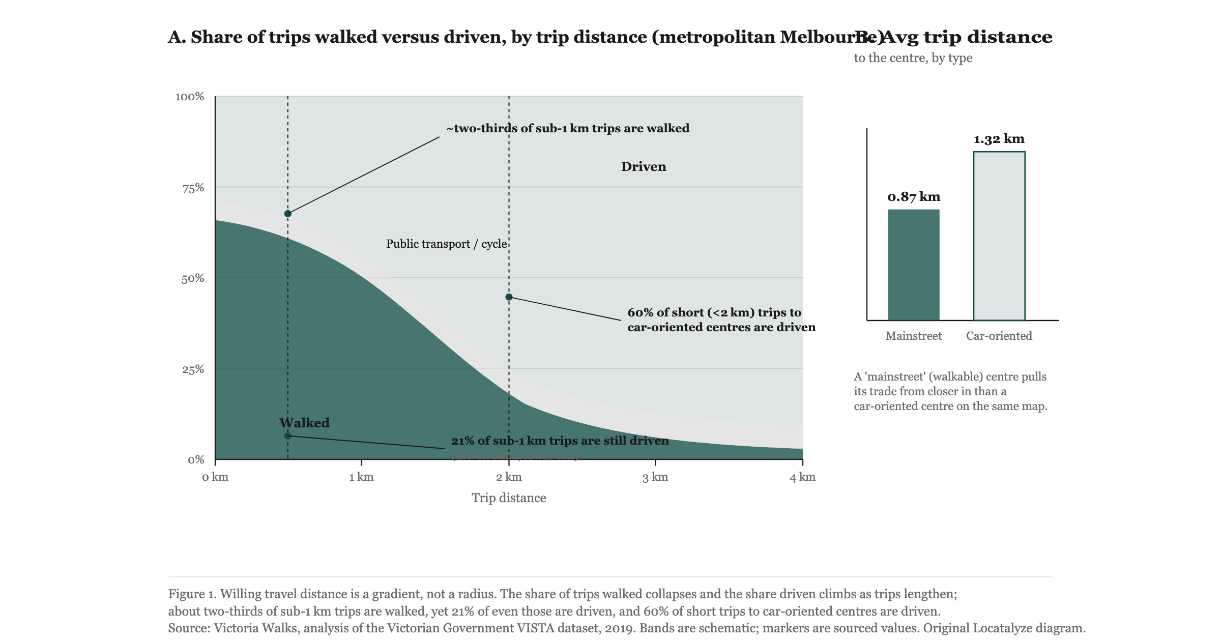
Figure 1. A concentric trade area (left) assumes travel cost is identical in every direction. Travel-time isochrones (right) do not: the same site, measured in the same minutes, produces a tighter walk-time polygon and a wider, road-stretched drive-time polygon that stops dead at a river. Geometry after the Mapbox Isochrone API; PTA/STA convention after Leyshon Consulting (2017).
What a catchment actually is, and why the radius circle fails it
A catchment, in plain terms, is where your customers come from. Plot the home or workplace postcode of everyone who walks in over a month and you have an empirical catchment — the real one, observed rather than assumed. The trouble is that before you open, you do not have that data, so you have to model it. The radius circle is the laziest possible model: it assumes that travel cost is identical in every direction and that the only thing separating a customer from your door is straight-line distance.
Neither assumption survives contact with a real street. Travel cost is not uniform. A site three minutes from a customer along an arterial road is closer, in every sense that matters to whether they show up, than a site one kilometre away across a creek with a single bridge crossing two suburbs over. Distance as the crow flies is almost never the distance anyone travels, and the circle treats a river, a rail corridor, a six-lane road with no safe crossing, and an open footpath as if they were the same thing.
The fix is to measure the network, not the air. A travel-time isochrone is, in the words of the Mapbox documentation, "a line that connects points of equal travel time around a given location"; an isochrone API "computes areas that are reachable within a specified amount of time from a location" for driving, cycling or walking profiles (Mapbox Isochrone API). That definition is the whole correction in one sentence. Instead of a circle of constant distance, you draw a polygon of constant time, and that polygon bends around the things that actually slow people down. It stretches out along fast roads and pulls in tight where the network is poor or a barrier interrupts it. Figure 1 shows the contrast directly: the drive-time polygon on the right is lobed and lopsided and clipped by a river, because that is what reachability looks like once geography is allowed to have a say.
For a cafe, the relevant isochrone is a short walk-time band — roughly five to ten minutes on foot — plus, in a commercial district, the daytime worker population, which a residential radius misses entirely. A circle drawn around a CBD cafe counts the residents of apartment towers and ignores the eight thousand office workers who are the entire business. The mode of the trip changes which population even counts.
Trade area: the formal version, and where probability enters
If a catchment is the loose idea of where customers come from, a trade area is the disciplined version of it. The lineage here is worth knowing, because each step fixed a flaw in the one before.
It starts with William Reilly's Law of Retail Gravitation in 1931, the first spatial interaction model built for retailing. Reilly borrowed from Newton: two towns attract trade from a point between them in proportion to their size and in inverse proportion to the squares of the transport costs of reaching them. Bigger places pull harder; distance pushes back, and it pushes back sharply because the relationship is squared. It was a genuine advance, but it answered only a narrow question — given two competing towns, where does the customer in between go.
Paul Converse sharpened that in 1949 by adding the "breaking point": the precise distance between two centres at which their pulls cancel out, which let analysts draw a hard market-area boundary between two locations. Useful, but brittle. A breaking point implies that everyone on one side of a line shops at centre A and everyone on the other side shops at centre B, which is plainly not how anyone behaves. People are not assigned to a centre by a surveyor's line; they choose, and they choose differently on different days.
David Huff dissolved that hard boundary in 1964 and replaced it with probability, which is why his name is the one still in use. Huff defined a trading area as "a geographically delineated region, containing potential customers for whom there exists a probability greater than zero of their purchasing a given class of products or services offered ... by a particular firm or by a particular agglomeration" (Huff, 1964). Read that definition slowly. There is no boundary in it. There is no line beyond which a customer is "outside". There is only a probability that fades with distance and competition, and the trade area is the surface of those probabilities. A household two streets away might have an 80 per cent chance of choosing your store on any given trip; a household across town, with three closer alternatives, might have a 4 per cent chance. Both are in the trade area. Neither is certain.
The mechanism that produces those probabilities is the Huff gravity model:
Pij = (Sj / Tij^λ) / Σ(Sj / Tij^λ)
where Pij is the probability that customer *i* shops at location *j*, Sj is the size or attractiveness of store *j*, Tij is the travel time from *i* to *j*, and λ is the distance-decay exponent (Carleton College SERC handout). The numerator is one store's pull — its attractiveness divided by travel time, penalised by the exponent. The denominator is the sum of every competing store's pull, including yours. So the probability a customer chooses you is simply your share of the total gravitational pull they feel. Add a competitor, and every existing store's probability drops, because the denominator grew. That is competition modelled honestly, rather than assumed away by a circle.
The exponent λ is where the model earns its keep, and it is the dial most people never touch. Per the same SERC handout, "when λ is greater than 1, travel time has a greater effect, and when λ is less than 1, store size has a greater effect." In plain English: λ encodes how willing people are to travel for this category. For a daily, low-stakes purchase like coffee, λ is high — a few minutes of extra travel kills the trip, because nobody walks past a near coffee for a far one. For a destination purchase like a sofa, λ is low — people will tolerate a long drive because the size and selection of the destination dominates the decision. The same store, modelled with the wrong λ, gives the wrong trade area. This is the parameter that quietly separates a real analysis from a coloured-in circle.
The Australian building blocks: how you actually count people inside the shape
A trade area is only as good as the population you can read off it, and in Australia that means snapping your polygon to the Australian Statistical Geography Standard. The ABS rebuilt this framework in ASGS Edition 3, released on 20 July 2021 (ABS, ASGS Edition 3), and the three units that matter for catchment work nest cleanly inside one another.
The smallest is the Mesh Block — the ABS calls these the "building blocks" of the whole geography, each holding roughly 30 to 60 dwellings. Mesh Blocks are too small to carry most published statistics, but they are the atoms everything else is assembled from. Build up from whole Mesh Blocks and you get the SA1, which holds 200 to 800 people (around 400 on average) and numbers 61,845 across the country. The SA1 is the unit Census data is actually published at, which makes it the workhorse of any serious trade-area estimate: you intersect your isochrone with SA1s, apportion the ones the boundary cuts through, and sum. Build up again from whole SA1s and you reach the SA2, between 3,000 and 25,000 people, which the ABS designs to "represent a community that interacts together socially and economically." The SA2 is the level at which a trade area starts to look like a place people would recognise as their area.
The practical upshot is that the polygon and the population have to speak the same language. Draw a precise isochrone and then count people with a crude postcode lookup and you have thrown away most of the precision. Mesh Block and SA1 apportionment is the unglamorous step that turns a nice-looking shape into a defensible number. There is more on the population side of this in our explainer on reading foot-traffic data for retail and hospitality, which deals with the same problem from the demand-counting end.
How Australian planners actually define a trade area
It is worth grounding all of this in a real Australian document rather than a textbook, because the local convention has a hard number in it that the US teaching summaries do not.
In a 2017 Economic Impact Assessment for a centre at Holsworthy in south-west Sydney, lodged on the NSW Planning Portal, Leyshon Consulting set out the standard structure. The trade area, they write, "encompasses both a primary trade area (PTA) and a secondary trade area (STA)", and — the line worth memorising — "we expect that more than 80% of the centre's sales will originate from these two areas combined" (Leyshon Consulting, 2017). That is the verified Australian convention: the PTA and STA together should account for upwards of 80 per cent of turnover. If your two inner zones do not explain four-fifths of your sales, your boundaries are drawn wrong.
Just as important is how they say the boundaries get drawn. Not with a compass. Leyshon account for "the location and nature of existing competitive centres, the nature of the road network ... and any barriers to vehicular movement." Competition, roads, barriers — the three things a radius circle ignores, named explicitly as the inputs that shape a real trade area. This is the gravity model's logic written in a planner's prose: attractiveness relative to competitors, travel time along the actual network, and hard limits where the network breaks.
A word of caution on the numbers you will see elsewhere. The familiar rule that a primary trade area captures "50 to 80 per cent" of customers and the secondary and tertiary zones take progressively less is a useful teaching heuristic, but it is a US-flavoured rule-of-thumb that varies from source to source. Treat those specific primary/secondary/tertiary percentages as a convention, not a standard. The only hard, locally sourced figure here is the Leyshon one: PTA and STA combined, more than 80 per cent of sales.
The decision matrix: which method for which business
Here is the part that resolves the radius-circle problem into something you can act on. The right method, geometry and travel band depend on trip frequency and mode. The mapping below is analyst judgement applied to four common formats; the geometry convention is per the Mapbox Isochrone API, the PTA/STA structure is per Leyshon Consulting (2017), and the distance-decay logic is per Huff (1964).
Read the column on the right as the engine and the rest as its output. A cafe and a furniture barn are not different because of taste; they are different because λ is different, and λ is different because the trip is different. The cafe's customer makes a high-frequency, low-value decision where a few minutes of extra walking ends the trip, so the catchment is small, pedestrian and best measured as a walk-time band over the right population — including the office workers a residential count would miss. The destination retailer's customer makes an infrequent, high-value decision where a big, well-stocked centre justifies a long drive, so you need a full trade area, drive-time contours, and a gravity model that pits your centre against every rival people might choose instead.
The gym sits in between and is worth a sentence on its own, because the relevant geography is not really "near the gym" — it is "on the way home" or "near the desk". Membership decay is anchored to the commute, which is why a suburban gym is a drive-time business and a CBD gym is a walk-time one, and why the same brand needs two different catchment methods in two different locations.
Per-cell mapping above is analyst judgement, offered as a starting point rather than a law; a particular site's trip behaviour can shift a format up or down a band. The point is the discipline of choosing method from trip type, not the exact minutes.
A worked contrast: the cafe and the large-format retailer on the same corner
Return to the opening corner and run both businesses through the right method instead of the circle.
For the cafe, draw a five-minute walk-time isochrone. On a well-connected grid it might cover six or seven hundred metres in some directions and three hundred in others, where a main road has no safe crossing. Intersect that polygon with SA1s for the residential base, then layer the daytime worker population on top, because in a commercial pocket the workers are most of the trade and they live nowhere near the site. The catchment that falls out is a fraction of the 3 km disc — and that smaller, truer number is the one that tells you whether the rent is serviceable. Most cafe failures are not flavour failures; they are sites whose real walk-up catchment could never carry the lease, which is the recurring finding in our piece on the Australian cafe failure rate.
For the large-format retailer on the identical corner, the circle fails the other way. Draw a fifteen-to-twenty-minute drive-time contour and it reaches across several suburbs along the arterials and stops abruptly at the river, exactly as Figure 1 shows. Now bring in the gravity model, because this customer has choices: two rival big-box centres sit within the same drive time, and the Huff formula splits each household's probability between you and them according to relative size and travel time. A household that is closer to a rival, or closer to a larger rival, contributes less to your trade area even though it sits well inside your drive-time polygon. That is the honest picture the circle cannot draw, because the circle has no concept of a competitor existing at all.
Two businesses, one corner, two methods, two completely different demand estimates. The operator who draws one circle and applies it to both is guaranteed to be wrong about at least one, and usually both.
Catchment leakage, and the trap of counting the same customer twice
One more concept earns its place: catchment leakage. Leakage is the share of spending generated inside your trade area that flows out of it to stores elsewhere — the households who live two streets from you but do their weekly shop near work, or online. A trade area that ignores leakage counts resident spending as if it were all capturable, which is the over-statement error in a different costume. The gravity model handles this implicitly, because a household with a high probability of choosing a competitor is, by construction, leaking to that competitor. A radius circle cannot model leakage at all; it assumes every dollar inside the line is yours for the taking.
The mirror image is inflow — spend arriving from outside your defined area, which is exactly why the Leyshon convention allows up to 20 per cent of sales to originate beyond the PTA and STA. A trade area is a net of probabilities, not a fence. Catchments also drift over time as an area's demographics and competition change, which is its own analysis; the signals that a neighbourhood is shifting under your feet are covered in our note on reading gentrification signals in commercial property.
What this does not cover
This is a method piece, and methods are simplifications, so be clear about the edges. A gravity model is only as good as its inputs: it needs a defensible attractiveness measure for every competing store (floor area is a common proxy, but it is a proxy), a calibrated λ for the category, and a travel-time matrix that reflects real conditions rather than free-flowing 3 am traffic. None of that is free, and a poorly calibrated model can be more confidently wrong than an honest circle.
It also does not settle online substitution. For categories where a large share of demand has moved to delivery or e-commerce, a physical trade area describes a shrinking slice of total spending, and no amount of polygon precision recovers the rest. Daytime-versus-residential population, tourism and event-driven spikes, and one-off trip generators like a hospital or a university all bend a real catchment in ways a static model smooths over. And the ABS geography, clean as it is, is a snapshot; boundaries and populations move between releases. Treat the output as a well-reasoned estimate with stated assumptions, not a measurement.
Practical implications
If you take one operational habit from this, make it this: choose your method before you draw anything. Name the trip first. How often does the customer make it, and how do they get there. Daily and on foot means a walk-time catchment and, in a commercial setting, a daytime worker count. Weekly and by car means a drive-time PTA/STA trade area. Infrequent, high-value and by car, with real competitors in range, means a full trade area with a Huff model and a low λ. The geometry is downstream of the trip, never the other way around.
Then sanity-check against the one hard local benchmark. If your primary and secondary trade areas do not plausibly explain more than 80 per cent of expected sales, your boundaries are wrong — too tight if you are missing obvious customers, too loose if you are counting people who will clearly shop elsewhere. And count the people inside the shape at SA1 resolution, not by postcode, or you will have spent effort on a precise polygon and then blurred it at the last step.
The operators getting this wrong are not lazy. They are using the one tool everyone hands them — the radius circle — for jobs it was never built to do, and the error is invisible until the lease is signed and the foot traffic does not match the spreadsheet. The fix is not exotic. It is matching the method to the trip, and refusing to let a compass stand in for a road network.
If you would rather not assemble isochrones, SA1 apportionment and a calibrated gravity model by hand, that is precisely the work our platform does for a specific address — run a location analysis for your own site, or compare how the method plays out across markets in Sydney, Melbourne and Brisbane.
When you are ready to test a real tenancy against the right catchment rather than a circle, start with your address and business type and let the trip type pick the method.
Analyse your address →Frequently asked questions
Is a catchment the same as a trade area?
Not quite. A catchment is the area a site actually draws customers from — the loose, observable idea. A trade area is the formal delineation of that draw, usually probabilistic: per Huff (1964), a region of customers each with a probability greater than zero of buying from you, weighted by travel time and competition. In practice people use "catchment" for simpler walk-up or drive-time bands and "trade area" for the structured PTA/STA-plus-gravity-model version, but the underlying object is the same set of customers.
What radius should I use?
Ideally none. A radius assumes equal travel cost in every direction, which no real street network provides. Use a travel-time isochrone instead — a polygon of equal travel time that follows roads and stops at barriers (Mapbox). If you are forced to quote a single figure, anchor it to the trip: roughly a 5–10 minute walk for a cafe, a 5–10 minute drive for fast-casual, longer drive-time contours for destination retail. Those are rules-of-thumb, not standards.
What is the Huff gravity model in one line?
It estimates the probability a customer chooses your store as your store's pull (attractiveness divided by travel time, penalised by a distance-decay exponent λ) as a share of the combined pull of every competing store (SERC handout). It replaces hard market-area boundaries with probabilities, which is why it handles competition and leakage honestly where a circle cannot.
How do I count people inside a trade area in Australia?
Snap the polygon to the ABS geography. Apportion at the SA1 level — 200–800 people each, the unit Census data is published at — building up from Mesh Blocks where a boundary cuts a zone, and read SA2s for the broader community picture (ABS, ASGS Edition 3). Postcode-level counts are too coarse and will waste the precision of a good isochrone.
References
David Huff, "Defining and Estimating a Trading Area," *Journal of Marketing*, Vol. 28, No. 3, 1964, pp. 34–38. Definition wording drawn from secondary academic summaries; not page-verified.
Carleton College, Science Education Resource Center (SERC), academic handout on the Huff gravity model and the distance-decay exponent λ. https://serc.carleton.edu (rel="noopener").
William J. Reilly, *The Law of Retail Gravitation*, 1931 (first spatial interaction model for retailing). Paul D. Converse, "breaking-point" extension, 1949.
Mapbox Isochrone API documentation, definition of an isochrone and travel-time polygons for driving, cycling and walking profiles. https://docs.mapbox.com (rel="noopener").
Australian Bureau of Statistics, Australian Statistical Geography Standard (ASGS) Edition 3, released 20 July 2021 — Mesh Block, SA1 and SA2 definitions. https://www.abs.gov.au (rel="noopener").
Leyshon Consulting, *Economic Impact Assessment*, Holsworthy, July 2017, lodged on the NSW Planning Portal — primary/secondary trade area definition and the >80% PTA+STA convention. https://www.planningportal.nsw.gov.au (rel="noopener").
*Methodology note: the per-business-type method, geometry and travel-band mappings in the decision matrix are analyst judgement intended as starting points, not fixed rules. The specific primary/secondary/tertiary customer-share percentages sometimes quoted elsewhere are a US-flavoured teaching rule-of-thumb that varies by source; the only locally verified hard figure cited here is the Leyshon (2017) convention that the PTA and STA combined account for more than 80% of sales.*
About the author
Locatalyze Research Team
Location intelligence, Locatalyze
The Locatalyze research team builds the location-scoring models behind the platform and writes up what the data shows for Australian operators.
Tools first — then a full report for your address
Free rent, viability, and break-even checks. Upgrade when you are ready for competitors, map, and numbers for a specific site.
No signup required for tools