Sydney, Melbourne or Brisbane? We Analysed Where It’s Best to Start a Business
Locatalyze Research Team
Location intelligence, Locatalyze
We score 336 suburbs across Sydney, Melbourne and Brisbane on the same model. The median restaurant suburb differs by one point between the three cities. Inside a single one of them, the gap between the best and worst suburb reaches thirty-four. That ratio is the answer to the question in the headline, and this article is the working behind it — plus the five things that genuinely do separate the three cities, and a real recommendation for each.
How to read this article
**FACT** — supported by a named, linked source, or computed by us from a named public dataset with the method stated. **LOCATALYZE ANALYSIS** — our interpretation. **INFERENCE** — reasonable but not proven. Three datasets here are our own calculations: the suburb scores, which come from our published model; the driving detours, measured against the public OSRM routing service; and the coverage of each city's pedestrian counts, which we queried directly from the three councils' open data portals in September 2026. All three methods, and their limits, are set out under [Method, evidence and limits](#method).
What this is not
This is not a ranking of cities, and it is not advice to move. We have no view on your visa, your family, your supply chain or your capital, and those decide more than any score here. What we can do is answer a narrower question honestly: once you have chosen a city, how much of the outcome had that choice already decided? See our [methodology](/methodology) for how the scores are built.
The short answer, before the working
If you are choosing between Sydney, Melbourne and Brisbane for a food, drink or retail business, the honest answer is that the city is close to the least important decision you are about to make.
We score 336 suburbs across the three cities on the same model — demand, rent pressure, competition density, seasonality and tourism dependency, weighted by business type. FACT: the median restaurant suburb scores 63 in Sydney, 62.5 in Melbourne and 62 in Brisbane. FACT: for cafes, all three medians are 68. FACT: inside Melbourne alone, restaurant scores run from 50 to 84.
LOCATALYZE ANALYSIS: choosing the city moves the number by about a point. Choosing the suburb moves it by up to thirty-four. Everything below is an attempt to be useful about the smaller decision anyway, because the cities genuinely do differ — in their ceiling, their floor, how hard they are to move around, and how much you are allowed to know before you sign.
What we measured
Locatalyze scores a suburb for a business type out of 100, from five weighted inputs, and converts the score into a verdict — GO at 69 and above, CAUTION from 60, RISKY below that. The weights and thresholds are published in our methodology and the scores themselves are the ones on our city hubs, so nothing here is a private number invented for an article.
We took every suburb we model in the three cities — 115 in Sydney, 104 in Melbourne, 117 in Brisbane — and compared two things: the gap between the cities, and the spread inside each one.
FACT: on every business type we model, the gap between the three city medians is smaller than the spread inside any one of them. For restaurants that is 1 point against 17 to 34; for cafes, nothing at all against 21 to 33; for retail, 3 points against 18 to 36.
We tried to break it before we published it
There is an obvious objection. Our coverage of each city is not a census — it is the suburbs operators actually ask us about — and Brisbane's set reaches further into the outer ring than Melbourne's does. If Brisbane's median is dragged down by suburbs Melbourne's set simply does not include, the comparison is an artefact of our own coverage rather than a fact about the cities.
So we matched the sets. Ranking each city's suburbs by score and comparing only the top 60, then the top 40, then the top 25 of each, removes the coverage difference by construction.
FACT: across every cut, the between-city gap stays between zero and four points while the spread inside a single city stays between sixteen and thirty-four. LOCATALYZE ANALYSIS: the finding is not a coverage artefact. It survives the test designed to kill it, which is the only reason we are willing to lead with it.
Why three very different cities land in the same place
Three cities with different populations, climates, rents and cuisines should not produce the same median. That they do is the most interesting thing in the dataset, and the mechanism is visible in the inputs.
FACT: Sydney has the strongest average demand of the three and also the highest average rent pressure and the highest competition density. FACT: across all 336 suburbs, demand strength and rent pressure move together, with a correlation of 0.45.
LOCATALYZE ANALYSIS: the demand you are buying in Sydney has already been sold to you. A landlord in a high-demand suburb knows it, and a competitor has usually already opened there. The half-point of extra demand Sydney carries is met by roughly half a point more rent pressure and a third of a point more competition, and the three cancel to about a point of score. That is not a quirk of our weighting. It is what a functioning commercial property market does.
A correlation of 0.45 is moderate, not deterministic, and the gap between it and 1.0 is where the money is. INFERENCE: the suburbs worth finding are the ones where the pricing has not caught up with the demand — and those are found by looking at suburbs, not at cities.
What actually differs between them
The medians converge. Almost nothing else does.
Melbourne owns the ceiling, and the widest spread
FACT: Fitzroy scores 84 for restaurants, 87 for cafes and 82 for retail — the highest suburb in the three-city set on all three, and nine points clear of the next-best restaurant suburb anywhere. FACT: Melbourne also holds the lowest retail score in the set at 46, and its restaurant floor of 50 gives it the widest range of the three at 34 points — though the lowest restaurant score anywhere is Brisbane's, at 48.
LOCATALYZE ANALYSIS: Melbourne is the highest-variance city of the three. Its best addresses are better than anything Sydney or Brisbane can offer and its worst are worse, which makes it the city where the address decision carries the most weight and where getting it wrong costs the most.
One number we would check on the ground
Fitzroy scores 84 because the model reads it as maximum demand (10 of 10) on low rent pressure (4) and low competition density (3). The first two are consistent with everything else we see; the third is the one we would want re-checked at street level, because Brunswick Street is not an empty strip. **LOCATALYZE ANALYSIS: a score with one questionable input is still useful, but only if you know which input it is.** That is the whole argument for reading the factors rather than the headline number.
Sydney has the most workable addresses that are not already expensive
The prior is that Sydney prices operators out. On our numbers it has the opposite problem — too many options to sift, rather than too few.
FACT: 31 of Sydney's 115 suburbs, or 27%, score 65 or better for restaurants while carrying rent pressure at or below 5 out of 10. In Melbourne that is 20 of 104, or 19%. In Brisbane, 15 of 117, or 13%. The Sydney list is not the eastern suburbs — it runs through Newtown, Glebe, Marrickville, Ryde, Campbelltown and Cabramatta.
LOCATALYZE ANALYSIS: the Sydney list is drawn from the middle and outer rings, where real catchments sit outside the strips that get written about. That is consistent with a city built around several centres rather than one — but it is also the one statistic in this article that our own coverage could be inventing. Unlike the medians, we have not been able to test this share against a matched set, because matching by rank would remove exactly the suburbs it is about.
So treat it narrowly. FACT: these specific suburbs score 65 or better for restaurants on rent pressure of 5 or below — Newtown 72, Glebe 71, Marrickville 70, Ryde 70, Campbelltown 70, Cabramatta 70. Each of those is checkable on its own page. INFERENCE: there are more such suburbs in Sydney than the city's reputation suggests. We are not claiming there are proportionally more than in Melbourne — our coverage is not even enough to carry that.
Brisbane is the hardest of the three to move around, and Sydney is second
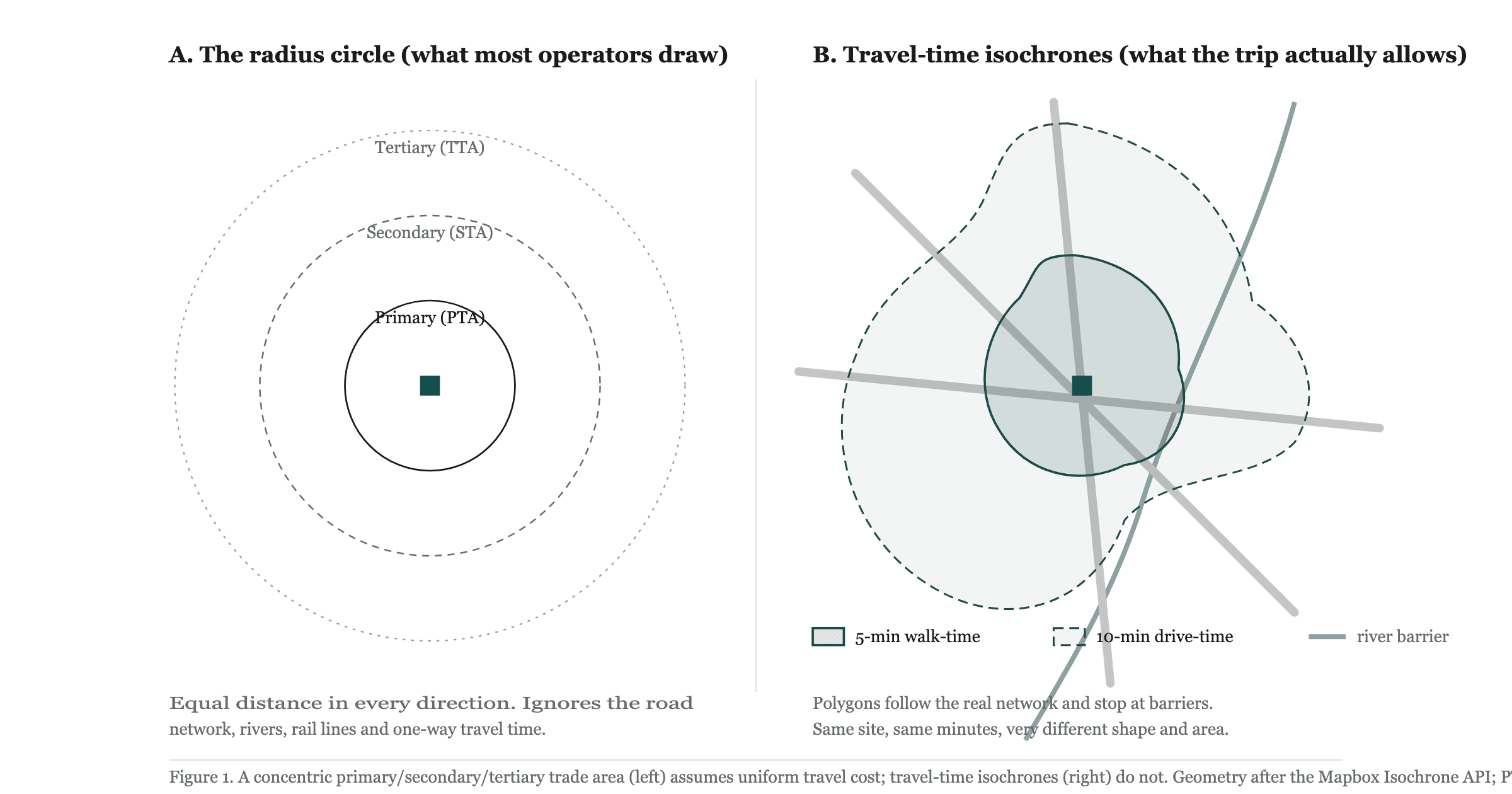
A catchment drawn as a circle assumes the road goes where the map suggests. We measured how badly that assumption fails, taking named inner-city dining precincts in each city, keeping every pair between 600 metres and 4 kilometres apart in a straight line, and asking a public routing service how far it actually is to drive.
FACT: Brisbane's median inner-city precinct pair is 1.59 times further to drive than to fly and Sydney's is 1.51, against 1.34 for both Melbourne and Perth. FACT: in Sydney, pairs separated by the harbour run at a median of 1.79 with five of twelve at double or worse, while pairs on the same side of the water run at 1.46.
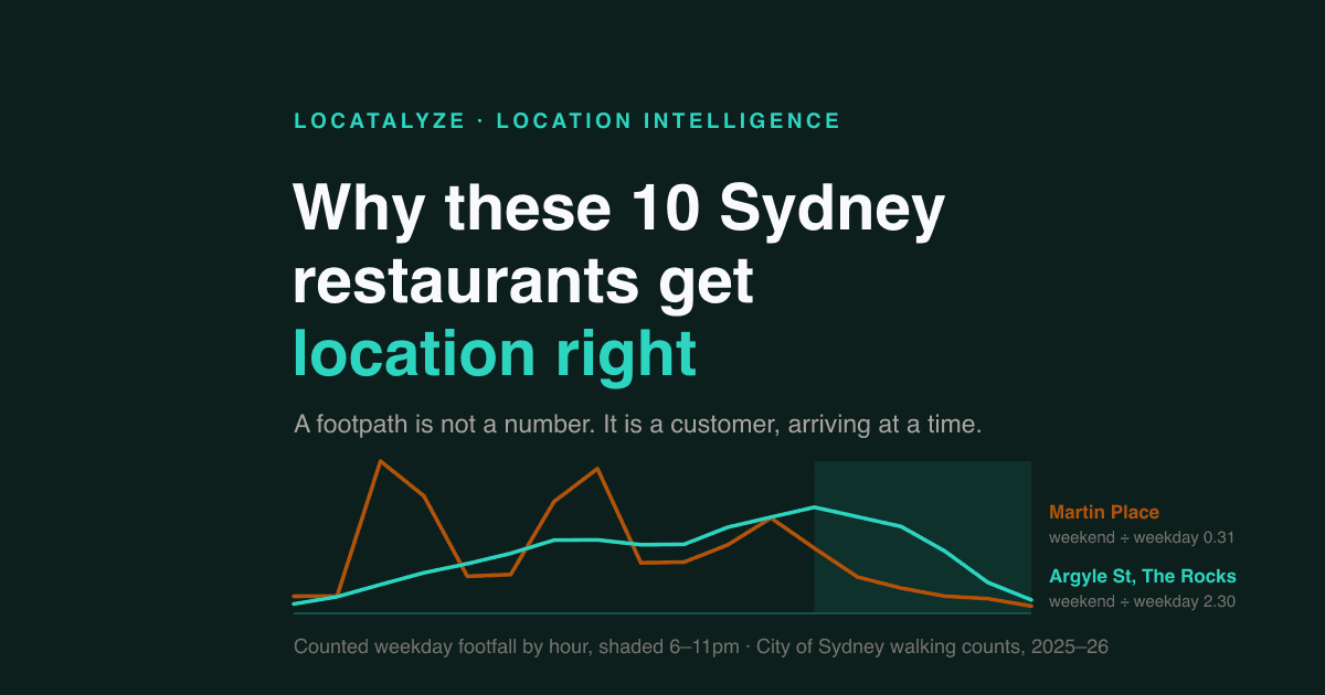
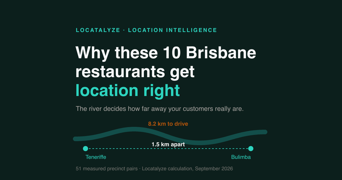
The two cities get there differently. Brisbane's penalty is the river and the small number of crossings — Teneriffe to Bulimba is 1.5 kilometres apart and 8.2 kilometres to drive. Sydney's has two causes: the harbour does the same job in the north, and the CBD's one-way grid does it in miniature in the centre, where Martin Place to The Rocks is 900 metres apart and 2.8 kilometres to drive.
The Sydney caveat we have to make ourselves
Nobody drives 900 metres across the Sydney CBD. For that pair the walking distance is close to the straight line and the driving detour overstates the barrier. **LOCATALYZE ANALYSIS: the number is a warning about how you draw a catchment, not a claim that every customer is in a car.** Where it matters most is the harbour and the river, because those are the pairs no amount of walking fixes.
All three let you check your foot traffic, and all three stop at a council boundary
This is the difference we did not expect, and it changed what we thought we knew. All three cities publish pedestrian counts as open data. What differs is how much of the city they cover.
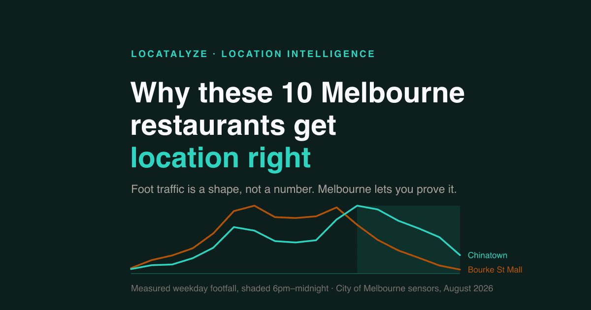
FACT: Brisbane City Council publishes 615,600 hourly pedestrian movement records, updated to 6 September 2026, from 15 sensor locations in the Queen Street, Brunswick Street and Chinatown malls. FACT: the City of Melbourne publishes hourly counts from 134 sensor locations. FACT: the City of Sydney counts about 130 sites twice a year.
Now the part that matters. Every one of those networks is run by a central-city council, and stops where that council does. FACT: the City of Melbourne's 134 sensors span a box from latitude −37.826 to −37.789 — we checked every one — and there is no sensor within 1.3 kilometres of Brunswick Street in Fitzroy, of Sydney Road in Brunswick, or of Bridge Road in Richmond. FACT: those three suburbs are the three highest-scoring restaurant and cafe suburbs in our entire Melbourne set.
LOCATALYZE ANALYSIS: the cities publish their best foot traffic evidence about the places our model rates least distinctive, and publish nothing about the addresses it rates highest. Fitzroy is the best-scoring suburb in three cities and you cannot look up how many people walk down Brunswick Street. Brisbane's counted footpaths are in two suburbs our model scores 58 and rates RISKY.
The three cities charge differently for the same mistake
A vacancy rate is a rough proxy for how quickly a bad decision can be unwound: the easier space is to find, the less leverage the landlord has and the shorter the term you can usually negotiate. On that measure the three cities are not remotely alike, and they contradict each other depending on which market you look at.
FACT: Melbourne has the highest CBD office vacancy of any Australian capital at 19.0%, and Brisbane the tightest of the three at 11.8%, falling a further 1.6 points by the middle of 2026. FACT: on shopfronts the ranking reverses — Sydney's CBD retail vacancy is 5.3%, the lowest of the CBDs in that survey, and Brisbane's is 16.7%, the second highest after Perth.
LOCATALYZE ANALYSIS: full towers and empty shops are not a contradiction, they are a description. Brisbane's CBD holds its workers and loses its shopfronts; Sydney's CBD is the reverse. INFERENCE: if you want negotiating room on a Brisbane CBD shopfront you have it, and the reason you have it is the same reason our model scores that CBD 58.
The same name, twice
Four suburb names in our set appear in two different cities. They are the cleanest natural experiment the data offers, because the name is held constant and everything else is not.
FACT: Brisbane's Paddington outscores Sydney's on all three business types, by seven points for restaurants and twelve for cafes. FACT: the two Fairfields score identically for restaurants and cafes and differ by three points for retail. FACT: Sydney's Manly, one of the best-known addresses in the country, is the only RISKY suburb in this table, and Brisbane's Manly — a bayside village of about 4,300 people — scores higher on all three.
Why the famous Manly loses to the obscure one
This is not a glitch, and it is worth walking through because it is the article's mechanism in miniature. Sydney's Manly has more demand than Brisbane's, not less: our model reads it at 9 out of 10 against 7, on the strength of the ferry, the beach and an affluent resident base. It then reads rent pressure at 8 and competition density at 8, against 6 and 5 in Brisbane.
LOCATALYZE ANALYSIS: the demand at Sydney's Manly is real, and it has already been sold — once to the landlord in rent, and again to the operators who got there first. What is left for a new independent is a high-rent, high-competition, tourism-dependent site with a seasonal curve. The model's own note is blunt about it: high demand is already in the score.
INFERENCE: this is the trap behind most city-level thinking. A famous name is evidence that other people have already found the place. It is not evidence that there is anything left in it for you.
The suburbs that actually top each city
If you want the lists rather than the argument, here they are. These are the five highest-scoring suburbs we model in each city, and every one carries a GO verdict except where noted.
LOCATALYZE ANALYSIS: read down the columns and the convergence is obvious again. Sydney's best restaurant suburb, at 73, sits between Brisbane's top two — Paddington at 75 and New Farm at 71. The three cities' top-five lists overlap in range almost completely, and only Melbourne's leader sits outside it.
The one entry that needs its footnote
Inala at 74 for cafes is the surprise in that table. Its cafe score clears the GO line on its own, but its composite across all three formats is 68, which lands it at CAUTION — the only non-GO composite in the top fives. The reason is legible in the inputs: demand 7 on very low rent pressure of 3. FACT: our model reads Inala as a recognised Vietnamese and multicultural food-and-grocery destination over a base of 15,273 residents, of whom 27.6% report Vietnamese ancestry. **LOCATALYZE ANALYSIS: that is the same cuisine-cluster pattern as Sunnybank — a catchment that is metropolitan rather than local, on rent that has not caught up. A high score on an unfamiliar name is an instruction to read the factor breakdown, not to sign a lease.**
So which one should you choose?
Having spent the article arguing the city matters less than you think, here is the part where it matters. These are the situations where the three genuinely separate.
Choose Melbourne if your concept is strong enough to earn a destination address
Melbourne has the highest ceiling in the dataset and the strips to match it. LOCATALYZE ANALYSIS: it rewards operators who can pull people to a specific door — because the top of the Melbourne distribution is nine points above the top of anywhere else, and because its high-demand suburbs carry the lowest average rent pressure of the three at 4.97 against Sydney's 5.98. It also punishes a weak concept harder than either of the others, because the floor is lower and the competition is denser on the strips that work.
Choose Sydney if you need options rather than one perfect site
Sydney's distribution is the tightest — 17 points from best to worst for restaurants, against 34 in Melbourne — and it has the deepest bench of suburbs that clear the bar without top-quartile rent. LOCATALYZE ANALYSIS: that is the right city for an operator who has to find a site inside a lease deadline rather than wait for one, and for a format that travels — because when the spread is narrow, the cost of not landing your first-choice suburb is small.
Choose Brisbane if you are buying the cost base, and can prove your own demand
Brisbane has the lowest average competition density of the three at 4.91 and the lowest tourism dependency at 2.68, which is a way of saying its demand is more local and less borrowed. FACT: it also has the fewest suburbs at GO for restaurants — 7 of 117, against 12 in each of the others — and 96 of its 117 suburbs sit in RISKY for retail.
LOCATALYZE ANALYSIS: Brisbane is the city with the thinnest middle. The good addresses are genuinely good — Paddington at 75 outscores every suburb we model in Sydney — and there are fewer of them, they are separated from each other by the river, and the public evidence available to check them is the weakest of the three. It rewards operators who arrive with their own demand and their own numbers, and it is the least forgiving of the three to someone shopping on instinct.
Choose none of them yet if the answer changed your business
INFERENCE: if reading the three sections above made you want to change cities, the concept is probably not the thing carrying the plan. A format that only works in one of the three is a format with a narrow tolerance, and a narrow tolerance is a reason to test the specific address hard, in whichever city you were already in.
Five expensive beliefs about choosing a city
“Queensland is booming, so Brisbane is the opportunity”
FACT: in 2025–26 Queensland added 19,244 businesses, New South Wales 26,057 and Victoria 19,581, against a national entry rate of 16.9% and exit rate of 13.8%. FACT: Greater Brisbane and Greater Melbourne both grew 2.7% in 2023–24 and Sydney 2.0%. LOCATALYZE ANALYSIS: those numbers are real and they say nothing about your shopfront. A state's net business formation is dominated by non-employing registrations across every industry and every postcode; it does not tell you whether the strip you are looking at can carry another operator. The unit of the decision is a frontage, and no state-level series has ever described one.
“Sydney is unaffordable”
Sydney does carry the highest average rent pressure of the three, at 5.43 against Melbourne's 4.88. It also has Newtown at 72 for restaurants and Marrickville at 70, both on rent pressure at or below 5. LOCATALYZE ANALYSIS: “unaffordable” is a statement about six suburbs that get written about, and there are 115 in our Sydney set. The affordability question is answerable for a specific address in about ten minutes and is not answerable for a city at all.
“Melbourne is the food city, so Melbourne is the safest bet for a restaurant”
FACT: Melbourne's median restaurant suburb scores 62.5, half a point below Sydney's. FACT: Melbourne's own restaurant scores run all the way down to 50, the widest spread of the three cities. LOCATALYZE ANALYSIS: Melbourne's reputation is built on its ceiling, and the ceiling is genuinely the highest here — but a reputation is a description of the best addresses in a city, and you will not be trading from the best address in a city. You will be trading from yours.
“We will start in the cheaper city and expand later”
INFERENCE: this is the belief with the largest hidden cost, because it treats the first site as a rehearsal. The three cities differ most in the things that do not travel — how far apart your customers effectively are, what you can verify before signing, and how much rope a landlord gives you. A format proven on a Brisbane arterial with parking has not been proven on a Melbourne tram strip, and the score it earned in one does not transfer to the other.
“The suburb score is the answer”
It is not, and this is our own model we are talking about. A suburb score is a base rate: it describes the ground an address stands on, not the address. Our Perth analysis found nine of ten trading venues in suburbs scoring 60 to 74, six of them CAUTION. LOCATALYZE ANALYSIS: use the score to decide where to spend your attention, then spend it on the frontage, the lease and the trade you can actually observe.
Compare the three cities yourself
The tool below carries the full dataset behind this article — every suburb we model in the three cities, on one axis. Switch the business type and watch the three cities stay stacked while the suburbs inside them spread out. That picture is the article's whole argument in one graphic.
336 suburbs · Locatalyze model, August 2026
The city barely moves the number. The suburb moves it a lot.
Every suburb we model in the three cities, placed on one score axis. Switch the business type and watch what happens: the three cities stay stacked on top of each other, while the suburbs inside each one spread right across the chart.
Between the three cities, the median restaurant suburb differs by 1 point. Inside a single city, the gap between the best and worst suburb reaches 34 points.
Median 63 · lowest Hunters Hill 56 · highest Darlinghurst 73 · 12 of 115 at GO
Median 62.5 · lowest Armadale 50 · highest Fitzroy 84 · 12 of 104 at GO
Median 62 · lowest Chermside 48 · highest Paddington 75 · 7 of 117 at GO
The best restaurant suburb in Melbourne is Fitzroy at 84. That single address scores higher than every one of the 115 suburbs we model in Sydney, where the ceiling is Darlinghurst at 73.
| City | Suburbs modelled | Lowest | 25th percentile | Median | 75th percentile | Highest | Suburbs at GO (69 or above) |
|---|---|---|---|---|---|---|---|
| Sydney | 115 | 56 (Hunters Hill) | 61 | 63 | 66 | 73 (Darlinghurst) | 12 |
| Melbourne | 104 | 50 (Armadale) | 61 | 62.5 | 64 | 84 (Fitzroy) | 12 |
| Brisbane | 117 | 48 (Chermside) | 61 | 62 | 63 | 75 (Paddington) | 7 |
Locatalyze suburb model, engine 7.3.0, August 2026 vintage — the same scores published on our city hubs. Each dot is one suburb; the shaded band is the middle half of that city’s suburbs and the vertical rule is the median. Our coverage is not a census of every suburb in each city, so treat the counts as a description of what we model rather than of the whole metropolitan area.
The three-city shortlist checklist
Ten checks for anyone weighing more than one city. The first three are the ones that make the city question answerable at all.
Testing a real address
Everything above came from public evidence: our own published suburb model, a free routing service, three councils' open data portals, property market reporting and ABS releases. For one city that is an afternoon. For three cities and a shortlist of eight suburbs against a lease deadline, it is not.
That is the work Locatalyze does. You enter an address, a business type and a monthly rent, and the platform assembles the demand, competition, demographic and rent-pressure evidence for that specific frontage and returns a scored, sourced read with the reasoning shown. Financial figures are computed deterministically and never written by a language model — our methodology sets out where that boundary sits. For shortlisting before you get that far, start at the Sydney, Melbourne and Brisbane location hubs.
Method, evidence and limits
Suburb scores. Every score in this article is the Locatalyze suburb model, engine version 7.3.0, August 2026 vintage — the same numbers published on our city hubs, not a private calculation. Each suburb is scored out of 100 from five inputs (demand strength, rent pressure, competition density, seasonality risk, tourism dependency) weighted by business type, and converted to a verdict at 69 for GO and 60 for CAUTION. Our coverage is 115 suburbs in Sydney, 104 in Melbourne and 117 in Brisbane. It is not a census of any of the three metropolitan areas; it is the suburbs operators ask us about, and it reaches further into Brisbane's outer ring than into Melbourne's. That is why we re-ran the central comparison on rank-matched sets of 60, 40 and 25 suburbs per city and reported all four cuts rather than only the flattering one.
Driving detours. We took named inner-city dining precincts in each city — 16 in Sydney, 13 in Brisbane, and comparable sets in Melbourne and Perth — and checked every coordinate against the routing service's nearest-road endpoint, discarding any that snapped more than 60 metres away or onto a motorway, tunnel or bridge ramp. That filter earns its place: an unfiltered run in Brisbane put a Howard Smith Wharves point inside the Clem Jones Tunnel, and a first pass in Sydney snapped Milsons Point onto the Harbour Bridge approach. We then kept every pair between 600 metres and 4 kilometres apart in a straight line, took the great-circle distance from the coordinates and the driving distance from the public OSRM service, and reported the ratio. Brisbane's Kangaroo Point and Perth's South Perth failed the snap test and were excluded, which if anything understates those two cities.
Pedestrian count coverage. We queried the three councils' open data portals directly in September 2026 rather than relying on what each city says about itself, and the check changed our conclusion: we had expected to find that only Melbourne published hourly counts, and Brisbane publishes them too. One trap is worth naming. Searching the Melbourne sensor list for “Fitzroy” returns three hits, all of them in Fitzroy Gardens in East Melbourne, which is a park inside the council area and not the suburb of Fitzroy. We checked coverage by coordinates instead of by name, which is how we can say there is no sensor within 1.3 kilometres of Brunswick Street.
Limits, stated plainly. We do not have revenue, rent, margins or trading figures for any business in any of these cities and we have not estimated them. Scores are model outputs on one vintage and will move as inputs are revised. Routing reflects one provider's road network and typical-conditions travel time, covers driving only, and overstates the barrier for short central-city pairs that people walk. The correlation between demand and rent pressure is 0.45 — moderate, and not a claim that one causes the other. Vacancy figures come from two different surveys with different vintages and are quoted as published rather than reconciled. And the share of “workable and affordable” suburbs is the one statistic here that our own coverage could be creating, which is why it is flagged in the text rather than in a footnote.
Sources
Locatalyze is decision-support for location choice. Nothing here is legal, valuation, financial, insurance or investment advice. Scores are model outputs on the August 2026 vintage and are not a guarantee of any commercial outcome. Last checked 7 September 2026.
Frequently asked questions
About the author
Locatalyze Research Team
Location intelligence, Locatalyze
The Locatalyze research team builds the location-scoring models behind the platform and writes up what the evidence shows for Australian operators.
Tools first — then a full report for your address
Free rent, viability, and break-even checks. Upgrade when you are ready for competitors, map, and numbers for a specific site.
No signup required for tools